6 Mar 2020
Colors in our lives play not only an aesthetic role – they are also one of the basic means of expression. We often make our decisions based on a color message whose meaning is hidden in our subconsciousness.
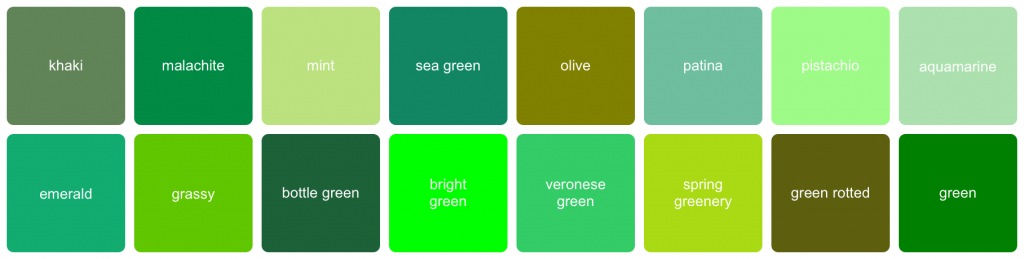
Color green
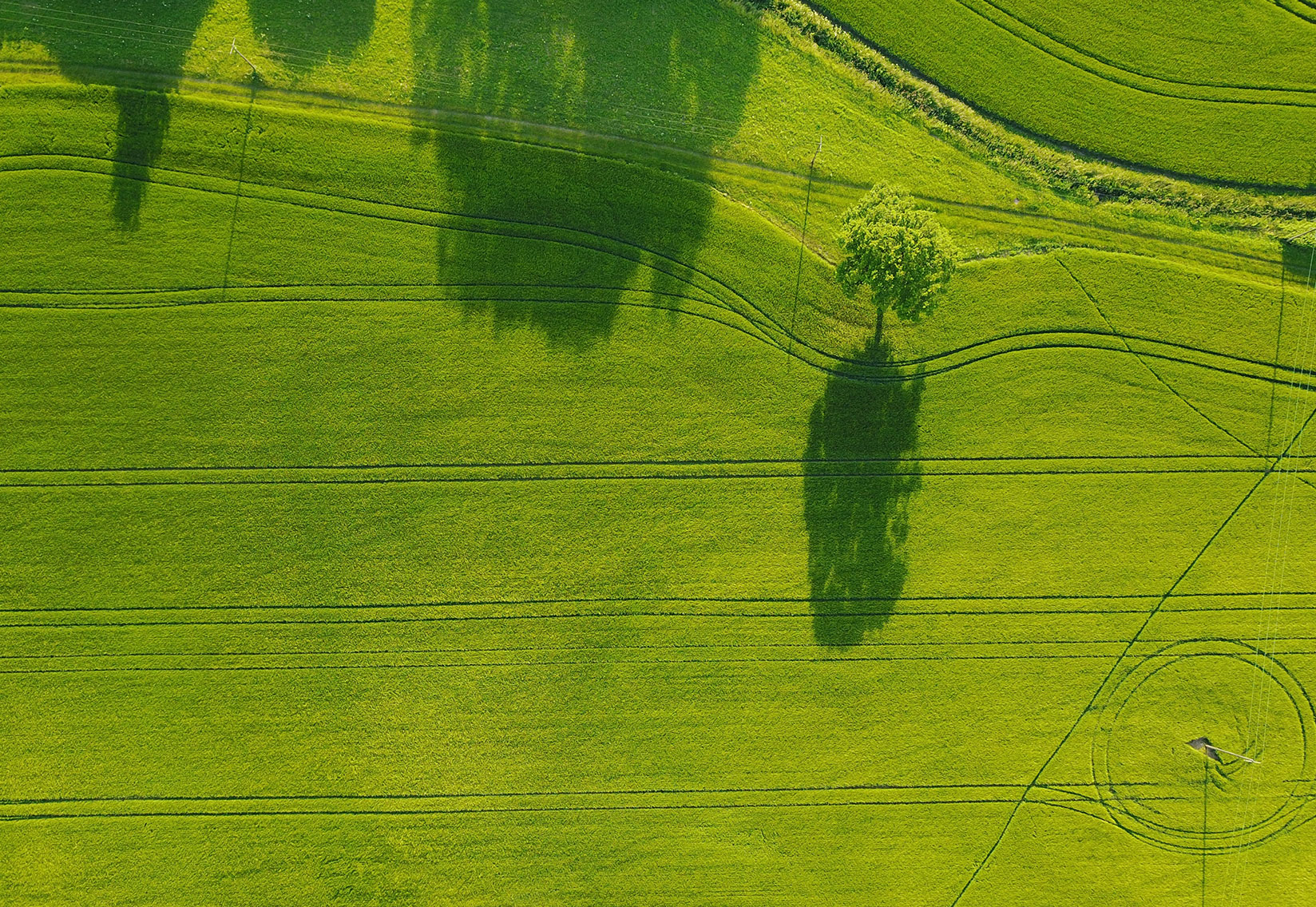
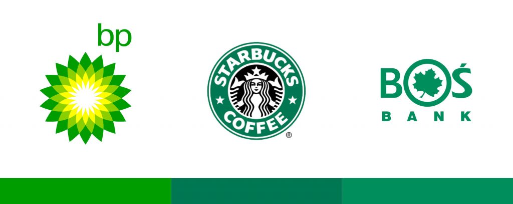
This color is associated primarily with nature and harmony. He is credited with relaxing and soothing senses. Therefore, it is recommended to have green plants in the office spaces. For the same reason, hospital corridors are painted in shades of green. Green is also used to emphasize security, natural origin or money. This color is used by brands such as BP or Starbucks.
Green is also pejorative.
In the Middle Ages, this color was associated with the devil himself. It was believed that it attracts evil and bad luck – maybe that’s why bright green is today considered a venomous color, symbolizing decay and danger, while pale green is the color of disease and jealousy.
Greenery can be both healthy and viable, as well as poisonous, ominous, like a swamp covered with green growth full of snakes and alligators. The green light at the intersection allows us to move safely, but when we see a green coating on food, do we hesitate to eat it?
Green in movies
Green can provide context, which allows the story to be given emotional significance. The double nature of the herb is well used in many films.
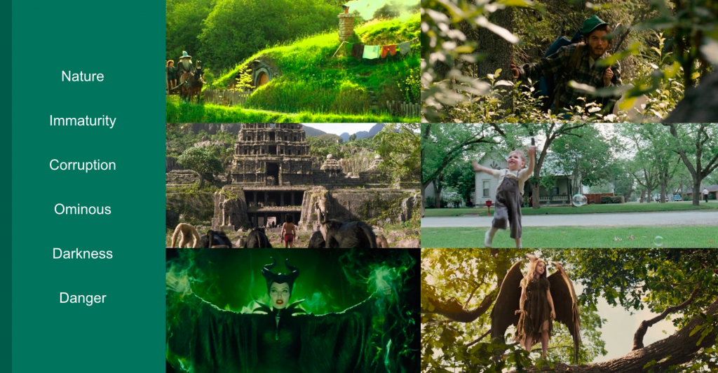
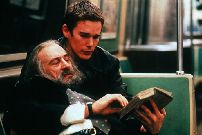
Great Hopes – American production from 1998 directed by Alfons Cuarón
Due to the color palette used, this film is called “green hopes”. The hero of the film, the painter Finegan Bell, at the beginning declares from behind the frame that color is a metaphor for subjective memory.
It is greenery and its ubiquity that supports and maintains our reactions to the characters and the film’s storyline. Individual frames multiply various shades of green in so many places that it sends contradictory signals – from healthy, fertile to poisonous – even cold. And when we receive them all at once, inside or outside, we feel unnatural. In the film, we see green in its natural state when it is rotten and weeded. When it appears in the reality created by man, it becomes artificial. In this way, an overdose of green becomes visual irony.

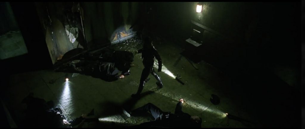
Matrix – film by the Wachowski brothers (sisters) from 1999
Already in the first scene the viewer is greeted by the venomous green of a mysterious string of characters appearing on a black screen of the monitor. The next scenes are a compilation of dark interiors and greenish lights. The interior of the dingy hotel room where Trinity is staying seems to be shouting: “degeneration!” This is not an accidental procedure – every scene taking place in a virtual, machine-made world, has a monochrome, greenish color palette. This is unnatural green, reminiscent of disease and decay. Over time, it allows the recipient to distinguish the real from the computer world.

Private Ryan – Steven Spielberg movie from 1988
The last movie scene: a military cemetery. The initial contrast of white stone and clean, fresh grass serves to build the emotion of the moment. The grass is green, which signals the beginning of the end of winter dead – spring comes after winter – revival. The pure white stone of the gravestone is a cool reminder that the young people who lie here will not have any spring. This is an essential element of the bipolarity of this place.
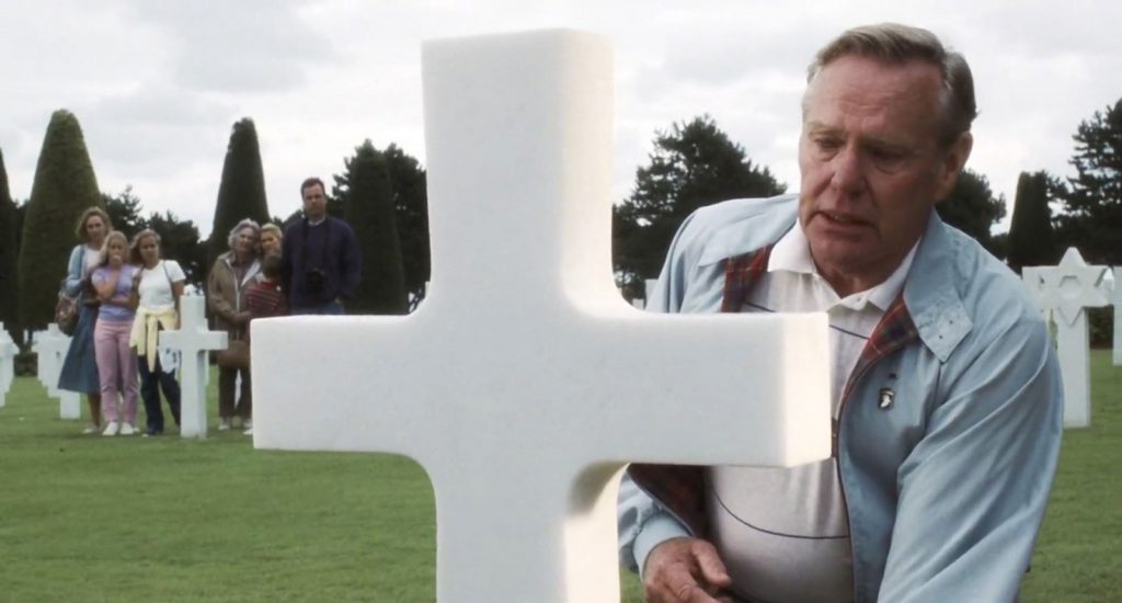

Spielberg knows how to show what it means to be human by juxtaposing contrasting images. Our sense of humanism is left untouched. All this brings us closer to the consciousness of people forced to murder each other, interspersed with intimate snapshots of natural beauty. We see and feel that if we do not understand these images, we will only have a dark picture of the nature of war.
A Thin Red Line – Terrence Malick’s 1998 film
A film adaptation of a James Jones novel. 1942. A unit of the American army lands on the Japanese-occupied island of Guadalcanal. Their task turns out to be a suicide mission (1).
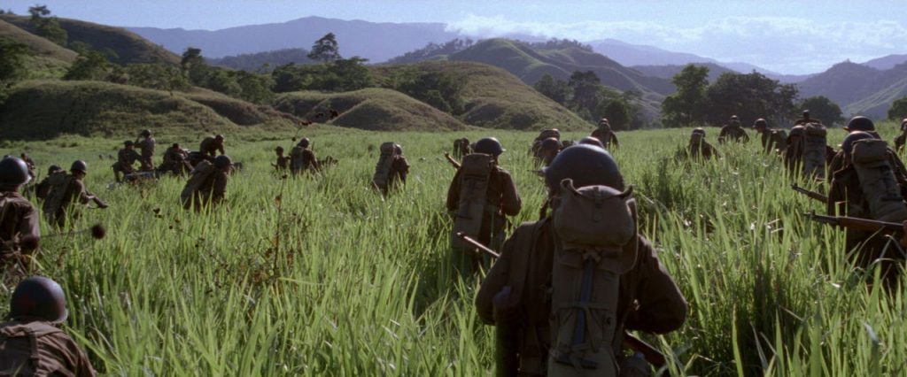

Green becomes a ubiquitous visual syntax of what is happening in the stories intertwining in this film. Green, thanks to the ability to stimulate both positive and negative reactions, becomes the main metaphor for the duality of existence itself. One moment we admire the beauty of tropical flora and a screen full of greenery, while the next we see a dead man falling into it.
This is green – the color of the kingdom of fauna and plants, especially those blooming in spring; new life, new freshness.
There is a kingdom of greenery between heaven and earth. Green is opposed to red – let us remind you that therefore it is the color of surgical apron. It happens that green replaces red when it occurs as a color of life, rebirth. It is a color that symbolizes hope, life and immortality.
(1) Source of the description: www.filmweb.pl
The tool used to generate palettes was: www.canva.com/color-palette/
-
 Talent Management vs Process Management. What is Most Important in Sales?
-
 Sales Force Automation (SFA) Platform: A Comprehensive Guide
-
 Sales Analysis Unveiled: Mastering Sales Reports for Business Growth
-
 Salesbook: The Complete Platform for Selling Solar Panels
-
 How to Find New Sales Leads?
-
 How to motivate a sales team? Step-by-step guide
Test Salesbook for Free
Any questions? Feel free to contact us.
+44 203 807 0179help@salesbook.com sales@salesbook.com
Our Customer Success Team is available from Mon. to Fri. 9am - 5pm CET.
We support inquiries, processes of configuration and use of Salesbook app, as well as billing and technical issues.